IRMS Website
How do you create a kick ass website in this mobile is everything and Google is God world? Where everybody is an expert but nobody trusts anyone? And demand is NOW but engagement is fickle? And the client is literally creating life?
Well, after we mastered the fetal position and contemplated a career change – we put on our big girl pants and breathed.
Seriously, we get this is a reactionary world we live in. Everything is go, go, go. But if you don’t take the time to pause, reflect and strategize – your sunk.
Sure – if you want just want something “up” and “pretty”, and engagement is defined as big, bold, call to action buttons – then you do you. All good. There are literally thousands of amazing digital designers and template themed solutions that can achieve just that.
To be abundantly clear, that’s not what we do.
We watch & listen. Our client IRMS, for instance, engages with their patients with such intimacy. Every journey is truly unique. Yes, that’s a nice & sweet marketing sentiment but it’s also 100 percent authentically true. Notwithstanding that the subject matter, creating a baby when infertile, is in itself such a deeply personal one, but to own that reality and share it, even with a doctor there to help, takes unbelievable courage. How do we know? We sat in the waiting room absorbing the mixture of angst and hope. We interviewed doctors and patients about their experiences. We visited the lab trying absorb the science. We talked to the finance counselors about affordable care & insurance. Complete audience immersion allows us to become advocates.
We stew: Loaded with all these experiences and information, we take a beat. Only from this contemplation comes the ability to create a core site philosophy.
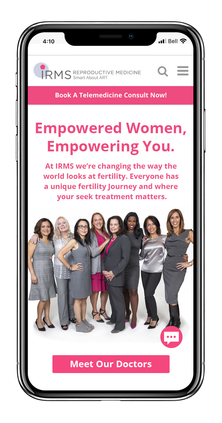
A simple theme of empowerment became our main focus. Empowerment formed by information, derived from cutting-edge science, and delivered compassionately by IRMS’ team. And beyond that kickass female team of fertility warriors, we also knew the best communicators of our message were the patients themselves. The site is a designed journey, and at every touch point we wanted to make sure they heard from their peers. For this journey to fertility can feel so singularly painful, and acknowledging there is a community of support within and beyond the clinic doors is critically important.

We build: Technically we were challenged both in the front and back end on how to communicate and translate, at times, dense, scientific subject matter to more snackable content that still builds authority. There was a mass of in-depth SEO work on the back-end. We completed a deep dive audit of all the content from a search point-of-view while not overloading with insincere keywords.

Knowing that patients need to share and unburden themselves, we added so many easily attainable contact sources. We constructed our own custom chat widget from scratch, so that IRMS would own the content collected rather than a third party, allowing us to protect our patients while also adapting the algorithm to learn and be responsive to patient inquiries.

We wrote, rewrote and then wrote content all over again as our design team engineered a graphic story that accompanied the user while empowering. Every color applied, every graphic designed and every bit of code had a purpose. Some nuanced others intentionally obvious.
We measure – everything. We monitor the site 24/7 allowing us flexibility to refine, add and amplify content that is engaging and searchable. It’s an organic lovely beast that needs to pivot when necessary, scale when ready, and pulse with energy and purpose.
